Spotlight on Blackpool hotels for their seaside typography
and live on Freeview channel 276
And now graphic designer Sarah Horn is aiming to showcase another of the town’s treasures: its typography.
We walk past examples of this artwork – the way of arranging letters and text – everyday when we pass road signs, shop banners and names of businesses.
Advertisement
Hide AdAdvertisement
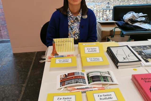
Hide AdSarah’s love of seaside typography led her to publish a photo-book about B&Bs in the town called En-Suites Available, published with Occasional Papers.

The book - a collection of photographs she took during her time at Blackpool University Campus for a project on typography – has become an archive of coastal architecture and vernacular typography.
The 29-year-old, who lives near Stanley Park, said: “I've always had an interest in typography. I am most drawn to those outlandish seaside styles, as they remind me so much of home.

“This particular selection of photographs was initially taken as research for a project I was working on at university, which briefed the students to research a specific typographic theme.
Advertisement
Hide AdAdvertisement
Hide Ad"I chose B&Bs since there’s hundreds of them in Blackpool, and because of my long-standing fascination with the typefaces and colours of seaside vernacular signage.
"I’ve since shot lots of signage all over the place, but nothing beats the signs in Blackpool.
"They’re very special to this part of the country.
“People’s renewed interest in local tourism since Covid-19 and a post-Brexit nostalgia made the project suddenly very relevant.”
To celebrate her book launch, Sarah and Justin Burns, lecturer and researcher of British seaside typography, will lead a Blackpool Type Walk on Saturday, May 14.
Advertisement
Hide AdAdvertisement
Hide AdStarting at the Comedy Carpet, the tour leads from the Promenade onto the adjacent streets and into the centre of town to showcase a selection of favourite signs from Sarah's book, alongside insights and historical references by Justin.
Sarah, who is a graphic designer at Studio.Build, said: “The B&Bs are definitely my favourite! They are so lively, they're eye-catching and they bring the viewer an instant nostalgic feeling.”
She added: "I am always looking for bold colour-palettes, intricate letterforms and stand out typefaces.
"I like the B&Bs that have those little extras too, those 'No Vacancy' signs or 'En-Suites Available'.
Advertisement
Hide AdAdvertisement
Hide Ad“I also love the beautiful brickwork typography around the Tower Building. Not immediately noticeable, but so stunning when you do spot it.
“And of course, our fantastic Comedy Carpet, where we are starting our tour!”
Typography is the art of arranging letters and text in a way that makes the copy legible, clear, and engaging to the reader.
It aims to give a certain message to the reader through its use of font style, appearance, and structure.
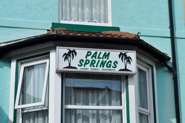
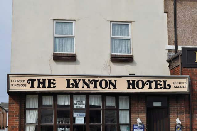
Examples of typography featured on the front of Blackpool accommodation venues that caught Sarah’s eye include The Lynton Hotel and Palm Springs Apartments, which are both on Hornby Road in Blackpool.
She also photographed the Arncliffe Hotel on Adelaide Street, Bradley’s Hotel on Albert Road, and The Address, on Reads Avenue, in Blackpool, which feature in her book.
Advertisement
Hide AdAdvertisement
Hide AdSarah will be in good company on the Blackpool Type Walk as Justin is head of art and design, at Leeds School of Arts, Leeds Beckett University.
His research explores how lettering, typography and the discipline of graphic design contribute to the development and experience of British seaside resorts.
The Blackpool Type Walk will take place from 10.30am until noon on May 14.
Advertisement
Hide AdAdvertisement
Hide AdAnd to order a copy of Sarah’s book, En-Suites Available, visit https://occasionalpapers.org/product/en-suites-available/