Who has come out on top in the Lancashire council logo league?
and live on Freeview channel 276
With a few notable exceptions, the county performed poorly in a nationwide countdown of council corporate imagery, compiled by graphic designer Robin Wilde.
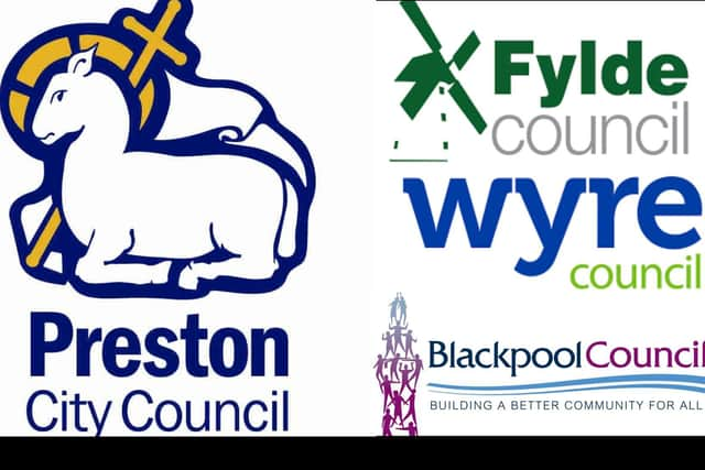
Preston City Council's emblem - featuring the city's distinctive coat of arms, with its instantly recognisable lamb - was higher-placed than any of its county counterparts, emerging in 69th spot out of 403 UK local authorities.
Advertisement
Hide AdAdvertisement
Hide AdNeighbouring Fylde came close to claiming the Lancashire council logo crown, with the district’s windmill design coming out just a few places short of Preston at number 74 in the niche league - which has proved a surprise viral hit.
However, that is where the good news ends for the county as a whole. In spite of boasting 15 councils within its administrative borders - giving Lancashire plenty of representation in this most unlikely of local authority league tables - the majority of them have ended up in the lower half of the branding chart.
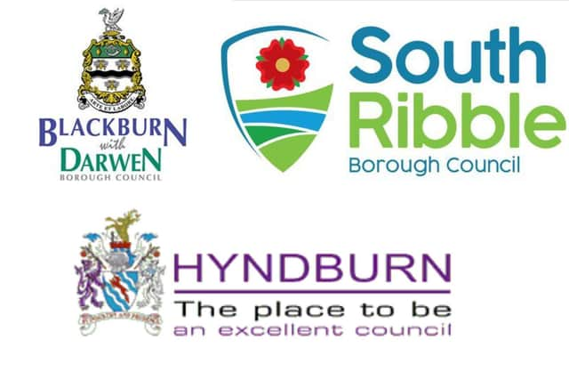
Three Lancashire councils - Hyndburn, South Ribble and Blackburn with Darwen - found themselves in the bottom 50. But even higher-ranked authorities were not spared the occasionally caustic commentary that accompanied the logo list, which Robin admits should not be taken “too literally”.
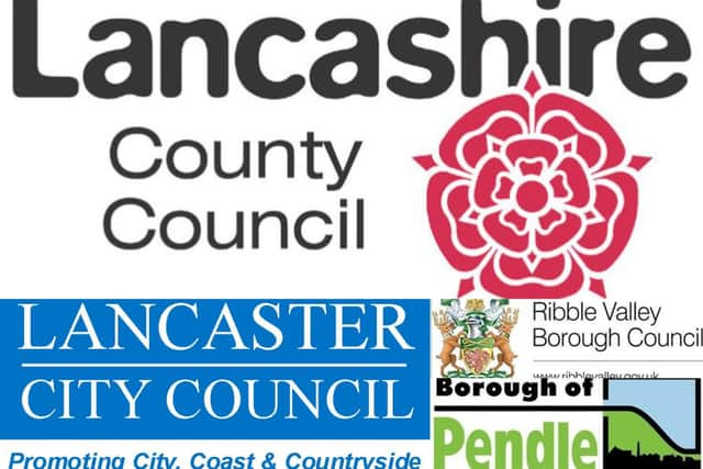
As the biggest authority in the region, Lancashire County Council, at least managed to achieve a place in top half of the table, at number 182 - but its lettering was nevertheless lambasted as looking like it had been “made of gelatine and then sucked on for half an hour”.
Advertisement
Hide AdAdvertisement
Hide AdSpeaking to the Local Democracy Reporting Service (LDRS), Robin acknowledges that Lancashire “doesn't come off too well” in his rankings - and explains why the council imagery used by Preston and Fylde caught his eye.
“I think the connecting factor [that sees them] performing pretty well is that they've both taken fairly traditional imagery and put them through contemporary design principles - that is, they've worked hard to condense them down to their key features and, in doing so, have created a logo that can serve usefully in the full range of functions the council might need to use it for.
“That's something traditional imagery can help you with, in that it gives you a starting point - but if you're too cautious you can be held back by not wanting to change it. I like that they've been a bit bold,” said Robin, who is also a freelance writer.
He says that the Lancashire councils whose imagery ignited his ire have generally committed one of two opposing design sins.
Advertisement
Hide AdAdvertisement
Hide Ad“In most cases it's either a lack of ingenuity - the logo is boring - or overambition - the logo tries to do too much.
“Most of the problems with the low-ranked logos come from a lack of confidence. It comes across sometimes as though councils aren't sure people will ‘get it’ if they use something simple, so that's where you get slogans and crests and extra text awkwardly jammed in, with the result that the effect is lost.
“If you look at the logos which did best, they have a bold and confident sense of themselves.
Some of this might be that the Lancashire identity is still a bit wounded from the 1974 reorganisation and the loss of Manchester and much of Merseyside, which has left the local authorities feeling a bit rootless.
Advertisement
Hide AdAdvertisement
Hide Ad“Compare them to Bedford, the best performing logo on the list, which has had a charter since 1166 and been a municipal borough since 1835, and consequently has a really strong sense of itself which it can proclaim quite boldly. York, which comes in second, is in a similar situation.
“Of course, I wouldn't take these rankings too literally - had I known 60,000 people would end up reading them, I might have put a bit more care into getting them in the right order rather than going for gags.
“I think it does try to get across an important point, though - which is that this is a bit of design we see very frequently from very early in life. Everyone grows up knowing the symbol on their wheelie bins or the libraries.
“But even though having a culture of design in local councils can be really helpful for making services work well, it's something people don't think about.
Advertisement
Hide AdAdvertisement
Hide Ad“The logos don't matter really, they're just the tip of the iceberg - but having the capacity to do good design can really affect people's quality of life in a council area,” Robin added.
The LDRS asked all of Lancashire's local authorities for their reaction to where they were placed in Robin’s rundown - here is his candid assessment and, where they responded, what the councils had to say about how their branding has been branded.
No. 384 (#15 in Lancs) - Hyndburn Borough Council
Robin: “I like the honesty of a sign that tells the truth about the emotions associated with a place and, on that measure, Hyndburn does not pass the test. I can imagine circumstances in which waking up in Accrington might be a blessed relief, but only if you’d previously had a bag put over your head and been knocked out with a cosh. I would also advise them on the necessity of punctuation. Hyndburn might be “the place to be an excellent council” but it’s suspiciously circumspect about the council they’ve already got. Also, mega-complicated crest plus modern fonts = no.
Council leader Miles Parkinson: “I did enjoy reading this article and applaud the extensive time and dedication it must have taken to compile. I would like to congratulate our Lancashire neighbours on their positions - it seems for us in Hyndburn, the only way is up! Commiserations to our ‘almost’ neighbours in Bury, they definitely did not deserve second-to-last place and overall, the North has certainly got a raw deal on this list.
Advertisement
Hide AdAdvertisement
Hide Ad“Whilst I would agree our logo is not the best in the land, I do disagree with the low position. We merge the old with the new, with a crest to represent our rich heritage. I would happily offer a tour of Hyndburn to the writer and show them first-hand why we are the place to be. Hyndburn includes many towns in addition to Accrington and hosts attractions such as the largest Tiffany glass collection in Europe and the highest number of green flag certified parks for any local authority in Lancashire.”
No. 360 (#14 in Lancs) - South Ribble Borough Council
Robin: “The new South Ribble logo was introduced in November last year and apparently has been embroiled in a “too modern” row, which tells you all you need to know about Northerners. It’s a nice attempt at reworking the crest and text cliché into something serviceable, but suffers from too many colours and the shoehorned Lancashire rose. However, it’s a damn sight better than the old one, so press ahead, I reckon.”
Speaking to the LDRS, Robin later added that a second glance was making him look upon the borough’s revamped imagery - which was designed in-house by the council and put out to public consultation in 2020 - “a bit more fondly”
He added: “Its main problem is that it's stuck halfway between old fashioned and modern - and needs to commit either way to make sense as a visual identity.”
Advertisement
Hide AdAdvertisement
Hide AdCouncil leader Paul Foster: “Everyone’s entitled to their own opinion but we’re really happy with our new logo. At least we’re all agreed it’s a major improvement on our old one. The previous logo had been in use for a long time and wasn’t fit for purpose, as our logo is now used across all sorts of different platforms - particularly with the growth of digital technology.
“We asked our residents what they wanted to see in a new design and, as well as creating something fresh for the future, it was also important to us to recognise our past and our rich heritage. We’ve kept elements from the old borough coat of arms and given them a modern twist, while we’ve included the Lancashire rose as an unmistakable symbol of the county we’re proudly at the heart of.
“The new brand has completely transformed how the council is presented and this matches with our ambitious programme to deliver major improvements for the people of South Ribble - including a £25 million revamp of Leyland town centre, the creation of affordable housing for local people, and major events such as next summer’s Music in the Park.
“We’re also glad it’s got people talking and we’re delighted to have had some fantastic feedback - even if there is no accounting for some people’s tastes!”
Advertisement
Hide AdAdvertisement
Hide AdNo. 352 (#13 in Lancs) - Blackburn with Darwen Borough Council
Robin: “This is an awkward council name to begin with, so why draw attention to it with that handwritten “with”? Blue and green, again, but at least in dark enough shades they don’t clash too horribly. Meh.”
No. 347 (#12 in Lancs) - Chorley Council
Robin: “I once applied to work for Chorley council and they never returned my application email, so marks off for that. I joke, but this is still very unremarkable but for the molten lava bubble in the middle.”
Council leader Alistair Bradley: “It was fun to see how all the councils fared, but it’s not a popularity contest - the logo is there to ensure our residents can see what the council is doing for them in their community and reflects our solid core values.
Advertisement
Hide AdAdvertisement
Hide Ad“A brand is much more than the logo on its own - it is how you are perceived and valued in your community and what residents tell us is that the council is a community leader and is very proactive in making Chorley a great place to live, work and visit.
“It was interesting to hear Robin admit he is a bit biased given that he applied for a job with Chorley Council and didn’t get it. It just shows that everyone wants to be part of what we do here in the borough and perhaps he can apply again with some great new ideas for us in the future.”
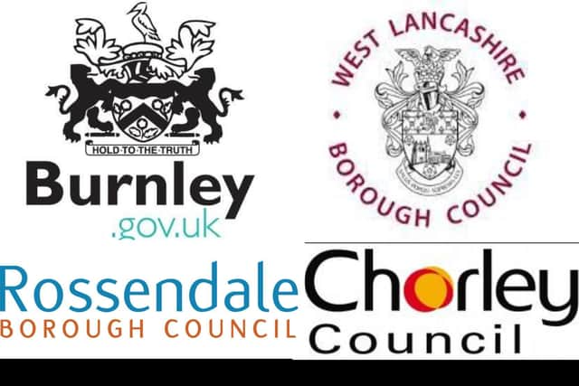
No. 316 (#11 in Lancs) - West Lancashire Borough Council
Robin: “Get in the landfill with the rest.”
Council spokesperson: “We are very proud of our council crest, which appears on our publications, signs, and vehicles and features references to the borough's heritage. The motto is 'Salus Populi Suprema Lex' which translates as 'the health of the people is the highest law', demonstrating that we are here to serve the people of West Lancashire and they are our top priority.”
No. 308 (#10 in Lancs) - Burnley Council
Robin: "Solid work adapting the crest here, which works well as a low-detail vector. Shame about the random teal top level domain info rammed on the end, which I’d excuse as not really part of the logo but I can’t find a version without it."
No. 290 (#9 in Lancs) - Rossendale Borough Council
Advertisement
Hide AdAdvertisement
Hide AdRobin: “Another designer trying to avoid my opprobrium by giving me absolutely nothing to work with.”
No. 244 (#8 in Lancs) - Lancaster City Council
Robin: “Friends of mine will know I have a visceral and slightly irrational hatred of Lancaster, formed by having to make the excruciating train journey up there to visit an ex-girlfriend several times. It has the hills of Sheffield, the grimy Victorian architecture of Leeds, and the rain of Manchester. I’m reliably informed that they used to have two Wetherspoons until one of them flooded. But I can’t bring myself to hate this logo. It’s just bland, like chewing on a piece of paper. It won’t nourish you, but it won’t poison you to death either.”
Council spokesperson: “Mr Wilde is to be commended for his enjoyable commentary on council logos, although the results could have been more in our favour. While obviously disappointed at not ranking higher, our logo has served us well for many years and is a reminder to all that the Lancaster district enjoys a vibrant mix of city, coast and countryside.”
No. 240 (#7 in Lancs) - Pendle Council
Robin: Pendle is notorious for having been a hotbed of BNP (British National Party) activity back in the day - and I believe was the last place to elect a BNP councillor. Anyway, that isn’t reflected in its logo, which is a chunky and almost cartoony arrangement let down by the squished text of the council name and the slightly odd border/line arrangement around the Illustration.”
No. 238 (#6 in Lancs) - Ribble Valley Borough Council
Advertisement
Hide AdAdvertisement
Hide AdRobin: “Inoffensive on almost every level, and unremarkable as a result.”
No. 182 (#5 in Lancs) - Lancashire County Council
Robin: “I’m not sure what’s going on with the wordmark here. It looks like it was made of gelatine and then sucked on for half an hour. It’s not an awful look, but jars badly with the very angular rose and supporting text.”
Council spokesperson: "We're really proud of our logo. It says exactly who we are and is instantly recognisable because of our county red rose – just what a good logo should be.
This ranking is a bit of fun and has given us something to smile about. Of course we disagree with our ranking – by proudly showing off the historic red rose of Lancashire, we're pretty sure our logo is the best in the country."
No. 175 (#4 in Lancs) - Blackpool Council
Advertisement
Hide AdAdvertisement
Hide AdRobin: “This is actually quite nice and a good combination of colours with a hint of contrast. The tower of people is a nice bit of illustration which the council seems frustratingly reticent to use, losing it some points on no fault of the designer’s. The stripes are a bit 2003 as well, hence why this strong concept doesn’t rank higher.”
The LDRS understands that the ‘tower of people’ element of the Blackpool Council logo was officially discontinued several years ago, but may still appear on some older council-branded material in the town.
No. 131 (#3 in Lancs) - Wyre Council
Robin: “I maintain it would be very funny if this corner of North Lancashire just ripped off the Wired Magazine logo (let’s be honest nobody has read it in years anyway) but this isn’t a bad stab at a wordmark with some nice satisfying kerning between the letters. It’s also pleasing to see they don’t feel the lack of confidence that drives so many councils towards ALL CAPS.”
No. 74 (#2 in Lancs) - Fylde Council
Robin: “The negative space windmill is a clever use of the concept but does rule this out from use against non-white backgrounds where the negative space won’t develop.”
Advertisement
Hide AdAdvertisement
Hide AdCouncil Performance and Improvement Manager Alex Scrivens: “I’m surprised and delighted to see how highly the logo placed, as it’s a design we made in-house. It was a joint effort between myself and Ross McKelvie, now our ICT manager, that we came up with about seven years ago.
The previous design, which we’d been using for years, was fine but could become difficult to read when resized. The brief for the redesign was firstly to retain the windmill, and secondly to stay with green as the council colour.
“We fished around for pitches from graphic designers in the area, but nothing really seemed to fit the bill, until Ross had the idea of stripping the old logo down into its essential lines and blocks, making a clear, more minimalist and modern design.”
No. 69 (#1 in Lancs) - Preston City Council
Robin: “Probably the most overtly religious logo in the mix here, impressive considering there’s at least two places named after saints. One suspects the city’s name might be a modernisation of Priest Town, and in common with much of the North West, the city does have a fairly impressive Catholic cathedral. In any case, it’s nicely drawn with a good colour contrast.”
Advertisement
Hide AdAdvertisement
Hide AdCouncil chief executive Adrian Phillips: “We’re pleased that the Preston City Council logo has been rated so highly on this list and appreciate the writer’s comments. He is correct that the name Preston is derived from Old English, meaning ‘Priest’s settlement’ or ‘Priest’s Town’. Preston is rightly proud of its ancient heritage and especially its historic Guild, which is dated back to 1179 when the then town received its first Royal Charter.
“The ‘Preston lamb’, which is significant in the logo, comes from the civic coat of arms and is very important to the city, reflecting its ancient and proud history and heritage. The current design has been in use since 2014 and was created by Prestonian and leading designer, Ben Casey, at no cost to the council.”
********
Robin’s full logo list can be seen here.
Comment Guidelines
National World encourages reader discussion on our stories. User feedback, insights and back-and-forth exchanges add a rich layer of context to reporting. Please review our Community Guidelines before commenting.